When it comes to managing recurring dashboards and reports, it’s tempting to fall back on the safe, tried-and-true “brute force” approach. Sure it might take an extra couple hours, but hey — it’s just the way it’s always been done, right?
I’ve seen it a thousand times, and I beg you to break those terrible habits. All that time you spend tediously copying and pasting data could (and should) be spent actually analyzing it. Exploring it. Understanding it.
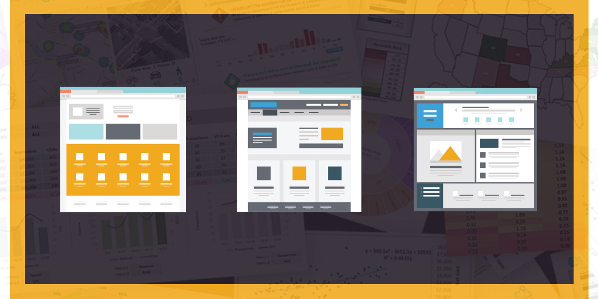
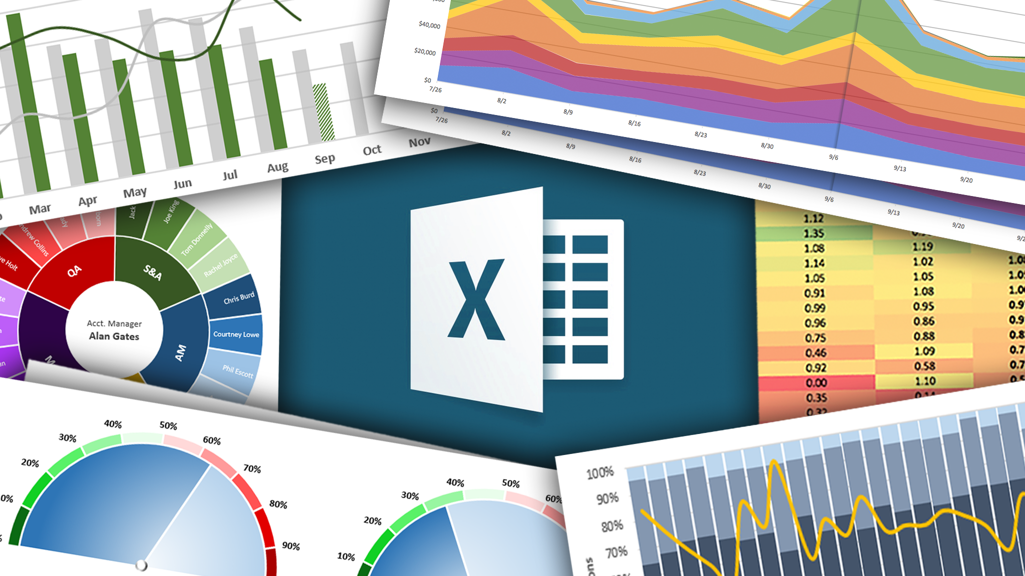
Luckily, Excel’s here to help. With a few clever functions, you can fully automate the process of blending, filtering, segmenting, and visualizing your raw data.
For example, by leveraging conditional stats functions like SUMIFS and COUNTIFS, you can apply custom criteria to not only filter and segment your raw data, but feed it directly into charts and graphs to create turnkey reports. Add some conditional formatting and user controls, and BOOM — you’ve got a dynamic and fully interactive dashboard.
Did someone say promotion??