The 6 Tips for Mastering the

Single Most Powerful Tool in Excel

By Chris Dutton

Master the PivotTable and Take Your Data Analytics Game to the Next Level

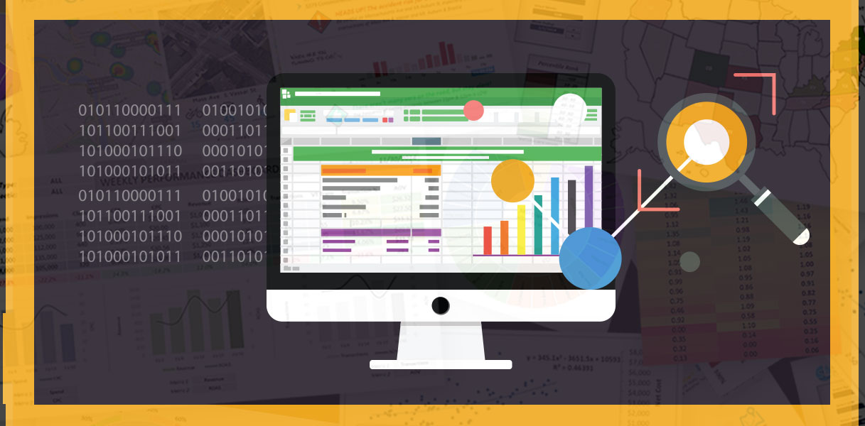
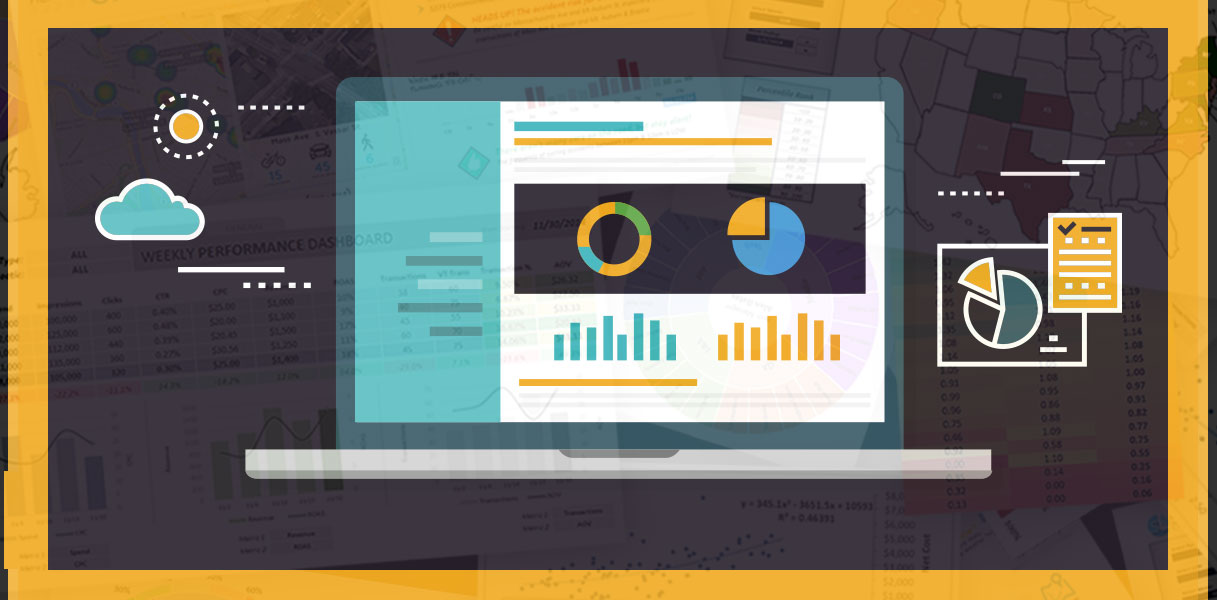
It’s a brave new world out there. An increasingly data-driven world, that is.

With the rise of the digital ecosystem, entire industries have been created to track and quantify our behavior — every video we watch, every ad we click, every product we view, and so on. How do you think Amazon knows which products to recommend? Or how Netflix knows which new series you’re most likely to watch?

Information has never been this accessible.

The idea of having all this data at our disposal is exhilarating, but overwhelming at the same time. How do you even begin to tackle a virtually endless stream of raw information? How do you know which numbers are significant, and which are just noise? If you’re savvy, then you know that the answer lies in sharpening your analytics skills.

The best place to get started? Excel!

More specifically, PivotTables — arguably Excel’s most powerful data analysis tool. PivotTables allow you to instantly organize, filter, summarize, and analyze your raw information through a flexible and user-friendly interface, exposing patterns and insights that may have otherwise been lost in the noise.

Whether you’re an Excel novice or a seasoned pro, read on for my 6 favorite PivotTable tips to help you become an analytics ninja:

TIP #1: To learn how PivotTables really  work, start with the field list

The first step to mastering any skill is understanding the fundamental concepts that make it work. Anyone can follow instructions, but unless you have a solid grasp of what’s going on behind the scenes, you won’t be able to harness the full potential of PivotTables.

So, how does a PivotTable really work?

In a nutshell, each individual cell is calculated independently based on its “coordinates” — defined by the rows, columns, and filters in your table. Using those coordinates, Excel drills down to that specific “slice” of raw source data, applies some sort of summarization (sum, count, average, max, etc.), and displays the result.

Pro tip: double click on any cell in your pivot to reveal the source data used to calculate its value

Now when it comes time to start exploring your data, the field list is your best friend. Think of the field list as your PivotTable “command center”, where you can assemble your data, set up filters and segments, and control the exact layout of your table by simply dragging and dropping your fields.

This is a great way to explore high-level trends and compare segments of your data, and expose the patterns and trends worth digging deeper into.

ACCESS THE FULL COURSE
Get 94% off my best-selling Pivot Table course today!

TIP #2: Explore your data from multiple angles

One thing that makes analytics so challenging is that insights often lurk just beneath the surface, yet remain virtually invisible until the data is broken down in an extremely specific way.

The good news? This is where PivotTables shine. Pivots allow you to apply custom segments and filters to your data, create calculated fields and metrics, and convert raw values into percentages, running totals, ranks or indices with the click of a button (no formulas or functions required!)

Let’s say you’re looking at sales data for a national manufacturer and searching for opportunities to cut costs. With PivotTables, you could break your data down by individual products or product categories, add calculated fields to compare margins and identify low-performers, cross-filter by geographic region to understand where certain products sell best, or explore trended sales to see which products may be losing momentum — all in a matter of minutes.

The bottom line? PivotTables are incredibly flexible and efficient tools for translating mountains of raw data into meaningful and intelligent insights.

ACCESS THE FULL COURSE
Sign up today and get the full course for only $29!

“I have been using Pivot Tables for some time now in my job but since I’ve started this course it has made me realize how much I have been missing that could have made my job so much easier.

– Meesy Goodwin

TIP #3: Use custom table layouts to generate new source data

How many times do you almost have the data you need, but not quite in the right format? Pivots allow you to instantly reshape and reorganize your data into any form you choose, without the tedious manual effort usually required (like aggregating rows to eliminate unnecessary fields).

Let’s say you decide to change which dimensions to feature in your table. Instead of wrestling with your source data by adding or removing fields, Pivots let you create new tables and custom layouts so that you can build the exact view that you need in a format that can serve as a brand new data source, with only a few clicks of the mouse.

It’s perfect for rolling up your data to a higher level of granularity, excluding extraneous fields, or generating source data for custom charts and graphs.

ACCESS THE FULL COURSE
Sign up today and get 94% off my best-selling Pivot Table course!

TIP #4: Unlock the option to filter text & value fields simultaneously

Here’s a tip I wish someone had taught me years ago: how to enable multiple filters in a PivotTable.

This option is hidden and disabled by default, but unlocking it will allow you to filter a table based on text and value fields simultaneously. Not only is this a timesaver, but you’ll be able to analyze data based on virtually any combination of criteria.

Just open up the PivotTable tools menu, click on Options, and select “Allow Multiple Filters”.

BOOM. Now you can mix and match text and value filters to your heart’s content. Who knows? You might even discover some unexpected insights!

“Wonderful course! I’m comfortable with pivots but it was great to reaffirm what I already knew and Chris ALWAYS finds a few hidden nuggets that help drive efficiency and improve my thought process.”

– Bob Grable

TIP #5: Use conditional formatting to expose patterns and trends

Data analysis and data visualization go hand in hand. Thanks to conditional formatting (which happens to be one of my all-time favorite Excel features!), you can easily draw attention to key trends and important patterns inside of your PivotTable.

Instantly bring your data to LIFE with conditional formatting rules like color scales, data bars and icon sets, which draw the eye towards meaningful trends and expose insights otherwise hidden in the noise.

Why is this important? The human brain has evolved to seek out and interpret patterns, so visual cues like conditional formatting only help to clarify and strengthen the story you’re trying to tell.

Pro Tip: Build cool, custom heat maps using a combination of color scales and invisible text. Use a custom number format (;;) to make overlying text invisible and instantly identify “hot” and “cold” spots in your data!

ACCESS THE FULL COURSE
Save up to 94% when you sign up for the full course today!

TIP #6: Build fully automated dashboards with PivotCharts and Slicers

If you want to really impress a crowd, learn how to create dynamic dashboards using PivotTables and PivotCharts.

It’s as simple as creating a PivotTable view, linking it to a PivotChart, and adding slicers and timelines that users can interact with to filter and explore the data. This is one of the simplest ways to build robust, interactive dashboards in Excel, and you can do it without writing a single formula.

Feeling even more ambitious? Link your Pivot to a database, then sit back and watch your dashboard update with the click of a button. Say goodbye to the tedious task of copying data and hard-coding numbers — you’ve just built a fully automated solution!

Sign Up for my Best-Selling

Data Analysis with PivotTables Course

If you’re excited about these tips and looking to unlock the full potential of PivotTables, then I invite you to sign up for my best-selling course: Data Analysis with Excel PivotTables

This course gives you a deep, 100% comprehensive understanding of Excel PivotTables and PivotCharts. I’ll show you whenwhy, and how to use PivotTables, introduce advanced sorting, filtering, and calculation tools, and guide you through interactive, hands-on demos and exercises every step of the way.

Join today and get lifetime access to exclusive demos and case studies, including shark attack records, stock prices, IMDb movie data, burrito ratings, and much more.

You’ll also get access to downloadable project files and homework exercises, 1-on-1 instructor support, and a 30-day money-back guarantee, all for only $29 for a limited time!

Limited Time Offer

Full Course Access for only $29

  • Lifetime Access

  • Downloadable resources & project files

  • Course quizzes & homework exercises

  • 1-on-1 instructor support

  • 30-day money-back guarantee

ACTIVATE MY DISCOUNT
Save Up to 94% when you sign up today!

Reviews from Students

Joanne Han

“I just love this course. I think of myself as an advanced user and I’ve taken many courses over the years, yet there are still tidbits I am still learning from Chris that I can apply to my day-to-day job. My previous employer sent me to a course that cost $2,000/day, yet that course was a waste of time. The quality of instructional videos, the homework materials, and caliber of the instructor is so much better than the other courses I’ve taken. I also appreciate the humour and personality of the instructor. Thank you!”

Paul Marriott

“Chris provides clear, detailed explanations and shows how to use pivot tables to extract hidden details and facts using raw, real-life data sets. The quizzes and homework reinforce the lessons and the course layout makes it easy to go back to sections that need revision. This course is exactly what I was looking for”

Daniel P. Venti

“Chris is outstanding. Best excel courses on Udemy, hands-down.”

Lauren Armstrong

“Really fantastic content! A great refresher and also learned many new tips and tricks. Highly recommend if you’re a business analyst”