POWER USER PRO TIP
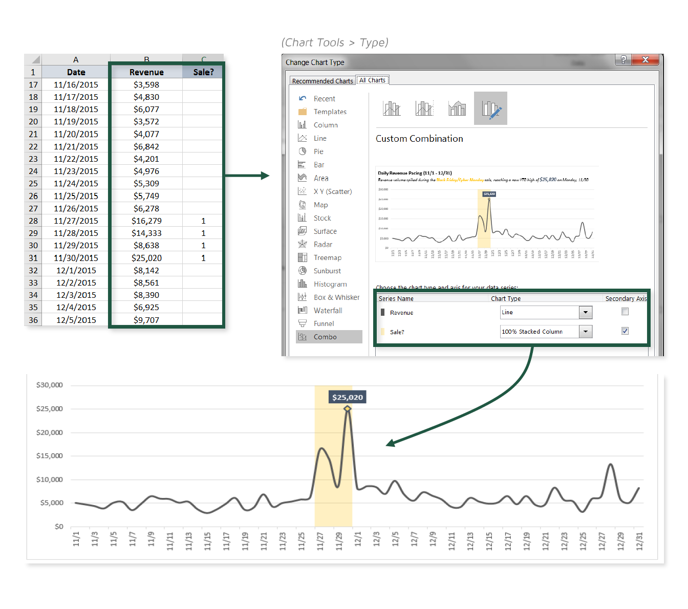
One of my favorite things about data viz in Excel is that you can mash together all sorts of chart types to create Frankenstein-style visuals. Generally this sort of experimentation will lead to ugly, confusing, or just plain ridiculous results, but with a bit of practice you’ll begin to discover some truly interesting and powerful combinations.
In this tip, we’ll practice combining a line chart with a 100% stacked column to draw attention to specific time periods within our sample sales data.
COMMON USE CASES:
- Highlighting sales or promotional periods to add context to charts
- Drawing attention to seasonal patterns or trends (i.e. peak vs. off-peak, weekends vs. weekdays)
Interested in learning more?
Sign up for the Pro Tips for Power Users online course today to unlock exclusive project files and resources.
The full course includes PDF eBooks and Excel project files containing every demo & dataset covered in the course — ranked by difficulty (1-5 stars), organized by category, and hyperlinked for quick access.
It’s time to start working smarter, not harder. If you’re looking to maximize efficiency, supercharge productivity, and become an Excel POWER USER, this is the course for you.
Exclusive Offer – Full Course Access
Excel Pro Tips for Power Users
Full Price $199 Today’s Price 75% OFF!
75+ Excel tips to help you work smarter, boost productivity and become a certified power user. You’ll receive lifetime access to:
-
10+ hours of high-quality video content
-
Downloadable eBook & Excel project files (with solutions)
-
Course quizzes to test your knowledge
-
1-on-1 expert support
-
100% satisfaction guarantee (no questions asked)