POWER USER PRO TIP
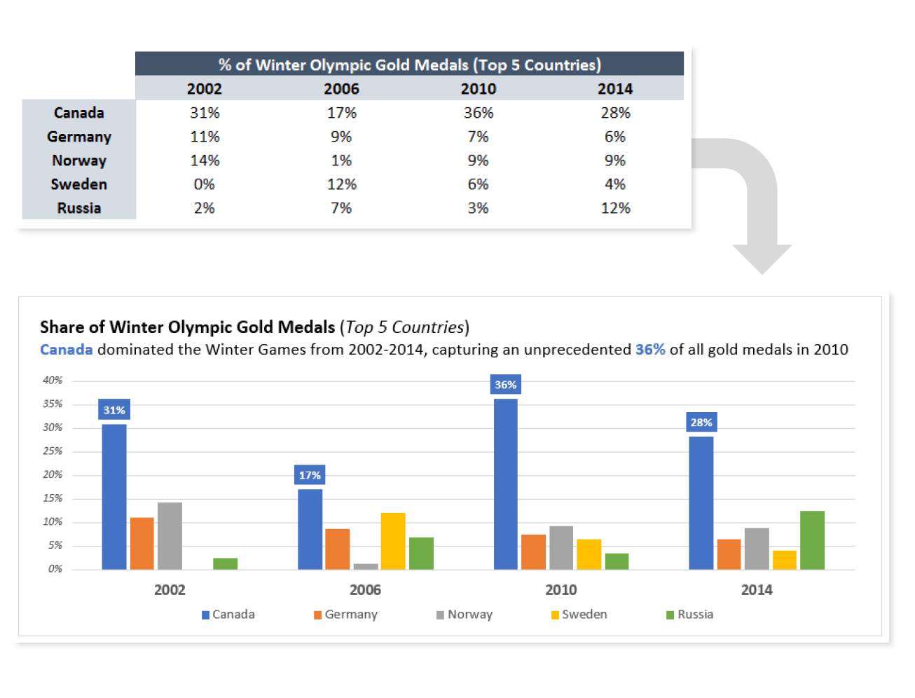
Most people don’t think of Excel as a “data viz” platform, but then again most people have never ventured beyond basic, default templates. The fact is, Excel offers an insane amount of creative freedom — if you know what you’re doing.
In this tip, I’ll show you how a few basic adjustments to colors, labels and titles can help bring your visuals to life.
COMMON USE CASES:
- Preparing visuals for use in presentations, where comprehension is key
- Reducing the risk of users misinterpreting the story that a chart is designed to communicate
Interested in learning more?
Sign up for the Pro Tips for Power Users online course today to unlock exclusive project files and resources.
The full course includes PDF eBooks and Excel project files containing every demo & dataset covered in the course — ranked by difficulty (1-5 stars), organized by category, and hyperlinked for quick access.
It’s time to start working smarter, not harder. If you’re looking to maximize efficiency, supercharge productivity, and become an Excel POWER USER, this is the course for you.
Exclusive Offer – Full Course Access
Excel Pro Tips for Power Users
Full Price $199 Today’s Price 75% OFF!
75+ Excel tips to help you work smarter, boost productivity and become a certified power user. You’ll receive lifetime access to:
-
10+ hours of high-quality video content
-
Downloadable eBook & Excel project files (with solutions)
-
Course quizzes to test your knowledge
-
1-on-1 expert support
-
100% satisfaction guarantee (no questions asked)