POWER USER PRO TIP
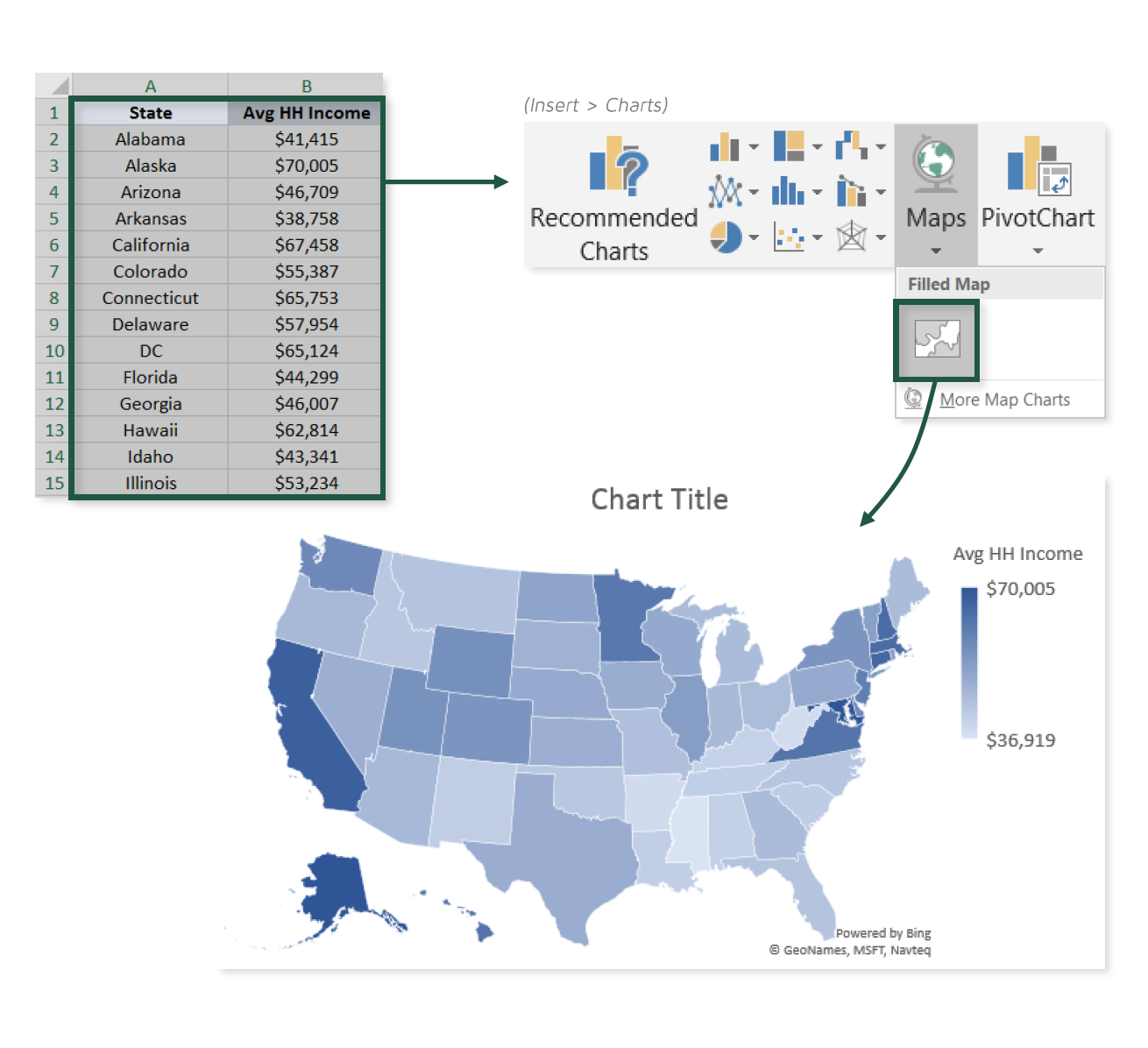
For those of you working with the latest versions of Excel, visualizing geospatial data just got a whole lot easier.
In this tip, we’ll practice plotting state-level population and income data using Excel’s new Filled Map visual, and discuss some important considerations to keep in mind along the way.
COMMON USE CASES:
- Quickly visualizing regional patterns or trends
- Comparing census information like population, GDP, income, or birth rates across areas
Interested in learning more?
Sign up for the Pro Tips for Power Users online course today to unlock exclusive project files and resources.
The full course includes PDF eBooks and Excel project files containing every demo & dataset covered in the course — ranked by difficulty (1-5 stars), organized by category, and hyperlinked for quick access.
It’s time to start working smarter, not harder. If you’re looking to maximize efficiency, supercharge productivity, and become an Excel POWER USER, this is the course for you.
Exclusive Offer – Full Course Access
Excel Pro Tips for Power Users
Full Price $199 Today’s Price 75% OFF!
75+ Excel tips to help you work smarter, boost productivity and become a certified power user. You’ll receive lifetime access to:
-
10+ hours of high-quality video content
-
Downloadable eBook & Excel project files (with solutions)
-
Course quizzes to test your knowledge
-
1-on-1 expert support
-
100% satisfaction guarantee (no questions asked)