POWER USER PRO TIP
One of the key principles of analytics is that numbers should always be presented in context. In other words, that fact that you sold 50 widgets this week means nothing — is that more or less than you sold last week? How does that compare against benchmarks?
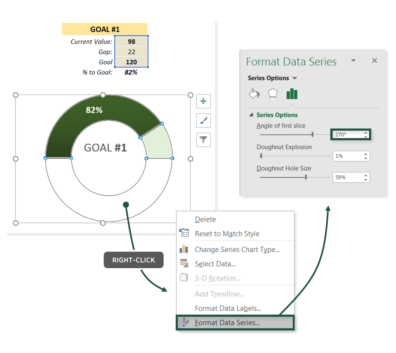
In this tip, we’ll discuss the importance of creating context using clear and measurable goals, and practice building custom gauge charts to visualize pacing in Excel.
COMMON USE CASES:
- Tracking performance against benchmarks or goals
- Designing executive scorecards to visualize key metrics at a glance
Interested in learning more?
Sign up for the Pro Tips for Power Users online course today to unlock exclusive project files and resources.
The full course includes PDF eBooks and Excel project files containing every demo & dataset covered in the course — ranked by difficulty (1-5 stars), organized by category, and hyperlinked for quick access.
It’s time to start working smarter, not harder. If you’re looking to maximize efficiency, supercharge productivity, and become an Excel POWER USER, this is the course for you.
Exclusive Offer – Full Course Access
Excel Pro Tips for Power Users
Full Price $199 Today’s Price 75% OFF!
75+ Excel tips to help you work smarter, boost productivity and become a certified power user. You’ll receive lifetime access to:
-
10+ hours of high-quality video content
-
Downloadable eBook & Excel project files (with solutions)
-
Course quizzes to test your knowledge
-
1-on-1 expert support
-
100% satisfaction guarantee (no questions asked)