POWER USER PRO TIP
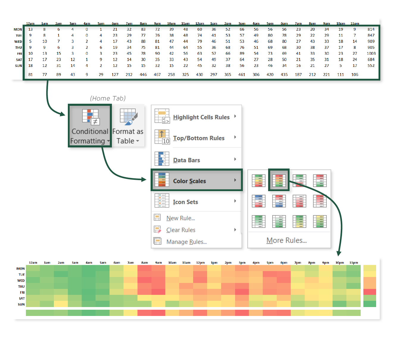
Would you believe me if I told you that one of my all-time favorite visuals in Excel doesn’t involve a single chart, object, or number? I hope so, because that would be a very strange thing to lie about.
This tip is all about using conditional color scales and custom number formats to create an incredibly simple — yet highly effective — heat map visual in Excel.
COMMON USE CASES:
- Quickly identifying patterns or trends using common color scales
- Highlighting “hot spots” or outliers based on the colors alone
Interested in learning more?
Sign up for the Pro Tips for Power Users online course today to unlock exclusive project files and resources.
The full course includes PDF eBooks and Excel project files containing every demo & dataset covered in the course — ranked by difficulty (1-5 stars), organized by category, and hyperlinked for quick access.
It’s time to start working smarter, not harder. If you’re looking to maximize efficiency, supercharge productivity, and become an Excel POWER USER, this is the course for you.
Exclusive Offer – Full Course Access
Excel Pro Tips for Power Users
Full Price $199 Today’s Price 75% OFF!
75+ Excel tips to help you work smarter, boost productivity and become a certified power user. You’ll receive lifetime access to:
-
10+ hours of high-quality video content
-
Downloadable eBook & Excel project files (with solutions)
-
Course quizzes to test your knowledge
-
1-on-1 expert support
-
100% satisfaction guarantee (no questions asked)